
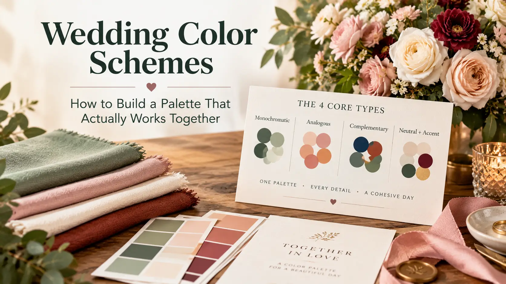
A wedding color scheme is a planned combination of two to five colors used in set proportions across attire, flowers, stationery, linens, and decor.
A strong scheme uses one dominant color for about 60% of the visual space, a supporting color for 30%, and an accent for 10%, and it follows a clear structure monochromatic, analogous, complementary, or neutral plus accent rather than a loose collection of favorite shades.
A list of pretty colors is not a scheme. A scheme tells you which color leads, which supports, and which adds contrast.
What Is a Wedding Color Scheme?
A wedding color scheme is the system behind your wedding colors. It defines the relationship between colors, not just the colors themselves.
Two weddings can both use sage, blush, and gold and look completely different. In one, sage dominates and gold appears only in cutlery. In the other, blush dominates and gold is everywhere. The proportions create the result.
A complete scheme answers four questions:
- Which color is dominant and will cover the largest surfaces?
- Which color is secondary and will appear in attire and major decor?
- Which color is the accent and will be used sparingly for contrast?
- Which neutrals will hold everything together in backgrounds, linens, and stationery?
Answer those questions in writing before you buy anything. That answer becomes every supplier’s reference.
The 4 Core Types of Wedding Color Schemes
Every reliable scheme fits one of four structures. Pick the structure first, then fill it with colors you love.
1. Monochromatic Schemes
One hue in several depths and tints: deep forest green, mid sage, and pale celadon, softened with ivory.
- Best for: Elegant, calm weddings where texture matters more than contrast
- Strength: Shades naturally belong together, so clashing is unlikely
- Risk: Flatness if every element sits at the same depth
- Fix: Vary value and texture — matte linen against glossy glassware, dark foliage against pale blooms
2. Analogous Schemes
Colors next to each other on the color wheel, such as peach, coral, and soft terracotta, or dusty blue, slate, and lavender-grey.
- Best for: Romantic, garden, coastal, and sunset-inspired weddings
- Strength: Blended transitions with no jarring contrast
- Risk: Low definition in photos if all colors share the same mid-tone depth
- Fix: Include at least one noticeably darker and one noticeably lighter member
3. Complementary Schemes
Colors opposite each other on the color wheel, such as navy and warm copper, burgundy and sage, or plum and soft gold.
- Best for: Bold, formal, and festive weddings
- Strength: Built-in contrast that makes both colors look richer
- Risk: Visual competition if both colors are used at equal strength
- Fix: Let one color dominate; use the other as supporting or accent color only
A 50-50 split rarely works. A 60-30-10 split does. When burgundy leads and sage appears in foliage and napkins, the pairing looks confident rather than loud.
4. Neutral Plus Accent Schemes
A foundation of neutrals — ivory, champagne, taupe, stone, charcoal, or black — plus one or two accent colors in controlled doses.
- Best for: Minimalist, modern, classic, and venue-led weddings
- Strength: Timeless and flexible if you change the accent late in planning
- Risk: Looking unfinished if the accent is too timid or scattered
- Fix: Repeat the accent at least three times in each space — napkins, florals, and signage — so it reads as a choice
This is the most budget-friendly structure: neutral linens and rentals are widely available, while the accent carries the personality.
| Scheme Type | Structure | Best For | Main Risk |
| Monochromatic | One hue, multiple depths | Elegant, calm weddings | Flatness without texture |
| Analogous | Neighboring hues | Romantic, garden, coastal weddings | Low contrast in photos |
| Complementary | Opposite hues | Bold, formal, festive weddings | Colors competing at equal strength |
| Neutral + Accent | Neutral base, 1–2 accents | Modern, classic, minimalist weddings | Accent looking accidental if underused |
Wedding Color Schemes by Season
Season should influence depth and saturation, not dictate your colors. Burgundy can work in spring and blush in autumn with adjusted shades and fabrics.
Spring Schemes
- Analogous, soft and fresh: Dominant ivory, supporting pale sage, accents of blush and butter yellow
- Monochromatic, romantic: Dominant soft lilac-white, supporting lavender, accent of deep plum
- Neutral plus accent, garden classic: Dominant warm white, supporting stone, accent of fresh green with apricot
Add one mid-tone color to pastels so they do not wash out in midday sun.
Summer Schemes
- Complementary, coastal: Dominant white, supporting dusty blue, accent of warm coral
- Analogous, sunset: Dominant peach, supporting coral and terracotta, accent of brushed gold
- Neutral plus accent, modern tropical: Dominant ivory, supporting warm taupe, accent of vivid green foliage with black details
Autumn Schemes
- Analogous, harvest: Dominant terracotta, supporting rust and amber, accent of cream
- Complementary, rich and formal: Dominant burgundy, supporting sage foliage, accent of antique gold
- Monochromatic, woodland: Dominant deep olive, supporting moss and fern, accents of ivory and natural wood
Texture matters here: dried grasses, wood, and matte ceramics deepen the palette without another hue.
Winter Schemes
- Neutral plus accent, candlelit classic: Dominant ivory and champagne, supporting charcoal, accent of deep emerald
- Complementary, festive but refined: Dominant navy, supporting warm copper, accent of cream
- Monochromatic, dramatic: Dominant black and charcoal, supporting graphite and silver-grey, accent of pure white florals
Wedding Color Schemes by Mood and Style
Season gives you a starting range. Mood gives you the final direction.
- Timeless and formal: Ivory dominant, navy supporting, gold accent — neutral plus accent
- Soft and romantic: Blush dominant, dusty rose supporting, sage accent — analogous
- Modern and minimal: Warm white dominant, black supporting, single accent of olive or rust — neutral plus accent
- Bohemian and earthy: Sand dominant, terracotta supporting, clay and cream accents — analogous
- Glamorous and dramatic: Charcoal dominant, deep plum supporting, metallic gold accent — complementary
- Fresh and joyful: Cream dominant, marigold supporting, coral and sky blue accents in small, repeated doses
Mood comes from the dominant color and contrast level, not the accent alone. For a calm wedding, choose a low-contrast structure.
How to Apply the 60-30-10 Rule
The 60-30-10 rule, borrowed from interior design, is the most useful tool for turning colors into a scheme.
- 60% dominant: Largest surfaces — table linens, drapery, stationery background, floral base
- 30% secondary: Attire, napkins, larger floral varieties, cake base, signage background
- 10% accent: Metallics, ribbons, candles, small blooms, shoes, menu text, favor packaging
Apply it room by room. Check the ratio separately in the ceremony, drinks area, reception, and cake table area.
Three rules keep the ratio working:
- Count colored lighting as color. Amber uplighting on ivory walls makes amber part of your dominant color.
- Count the venue itself. A red-brick barn, a marble ballroom, and a white marquee each contribute a dominant color before you add anything.
- Keep metallics inside the accent share unless you want a metallic-led scheme. Gold everywhere stops being an accent.
If a scheme feels wrong, proportions are usually the problem, not the colors. Swap the roles before abandoning the palette.
How to Build and Test Your Wedding Color Scheme, Step by Step
Step 1: Start From a Fixed Element
Begin with something fixed: venue walls and flooring, a dress already bought, or seasonal flowers you love. Fixed elements prevent schemes that only work in a blank room.
Step 2: Choose Your Structure
Decide the structure and write it at the top of your planning document. Test every later idea against it first.
Step 3: Select Three to Five Colors and Assign Roles
Pick a dominant, a secondary, an accent, and neutrals. Name actual shades, not families: “dusty blue” is a decision, “blue” is not.
Step 4: Gather Physical Swatches
Collect fabric swatches, paint cards, ribbon, and paper samples. Screens distort color on every device. Physical swatches tell the truth, and you can carry them to every appointment.
Step 5: Test in Your Venue’s Light
Bring the swatches to the venue at the time of day your celebration will happen. Check them in three conditions:
- Natural light near windows
- The venue’s standard ceiling or wall lighting
- Warm low light, using candles where the venue allows a quick test
Colors shift under warm light: cool greys can look brown, ivory can look yellow, and blush can disappear. A scheme that survives all three conditions will survive the day.
Step 6: Test on Camera
Photograph the swatch set, and ask your photographer how the palette behaves in their editing style. Saturated reds can bleed detail, and near-identical pastels can merge. Add a hand or white card for reference, and check dominant and secondary colors against a range of skin tones.
Step 7: Lock the Scheme and Share It
Create one reference — a photo of the final swatches with each color’s name and role beside it — and send it to every supplier.
Wedding Color Scheme Checklist
Before ordering anything in quantity:
- Structure chosen and written down
- Dominant, secondary, accent, and neutral colors named as specific shades
- 60-30-10 proportions assigned for ceremony and reception separately
- Venue’s existing colors counted in the dominant share
- Physical swatches gathered for fabric, paper, ribbon, and rental samples
- Swatches checked in daylight, venue lighting, and warm evening light
- Swatch set photographed and reviewed for contrast and skin-tone fit
- Wedding party attire tested against the swatches in person
- Florist briefed with shade names, roles, and flowers to avoid
- Stationery proof checked against paper swatches, not only on screen
- Metallics assigned to the accent share and used consistently
- One-page scheme reference shared with every supplier
- Accent repeated at least three times in each main space
Budget Guidance: Where Color Costs More — and Where It Doesn’t
Color itself is free. Specific shades, out-of-season flowers, and custom production raise costs. Prices vary widely by region, season, and supplier, so treat any quote as local.
Where color can add cost:
- Flowers in exact or unusual shades: Specific varieties, imported blooms, or dyed flowers may be needed
- Custom-dyed fabric: Matching to a non-standard shade usually costs more than an existing range
- Specialty rentals: Colored glassware, linens, and chairs often carry higher fees than neutral standards
- Rich stationery finishes: Dark backgrounds and metallic finishes typically cost more than dark text on light, standard stock
Where you can protect the budget:
- Build the dominant 60% from neutrals and standard rentals; spend on the 10% accent, where impact is highest
- Choose flowers by shade family and season, and give your florist freedom inside the palette
- Use lighting, candles, and paper goods to carry color at lower cost than colored furniture
- Reuse ceremony accents at the reception, such as aisle florals on the top table
The most expensive color mistake is reordering. A tested, locked scheme protects the budget better than any discount.
Common Mistakes to Avoid
- Choosing colors before seeing the venue: A scheme that ignores brick, wood, carpet, or marble fights the room all day
- Picking too many colors: Beyond five, including neutrals, most schemes lose definition. Edit rather than add
- Matching everything exactly: Identical shades look rigid and rarely match in practice. Coordinated shades look richer
- Ignoring undertones: Warm ivory, cool white, and grey-based blush can clash in every photo. Compare swatches side by side
- Using equal proportions: Five colors at 20% each create noise. Assign a leader
- Forgetting skin tones: Attire shades should be tested against real people, not only against each other
- Deciding from screens alone: Every device renders the same shade differently
- Changing the accent late without telling suppliers: A gold-to-silver switch affects cutlery, frames, foil, and cake details at once
Decision Guide: Choosing the Right Scheme for You
Work through these questions in order:
- What colors already exist in your venue? List them. They are part of your scheme whether you choose them or not.
- Do you want low contrast or high contrast? Low contrast points to monochromatic or analogous. High contrast points to complementary or neutral plus a strong accent.
- Which single color do you want guests to remember? That is your dominant or your accent — decide which, based on how bold you want the effect to be.
- What will be photographed closest to faces? Attire and bouquets. Prioritize flattering shades there; place other favorites in decor.
- How much do you want to spend on matching? A tight budget favors neutral plus accent with standard rentals. A flexible budget can support custom shades.
- Can you describe your scheme in one sentence? For example: “Ivory leads, dusty blue supports, copper accents.” If you cannot, the scheme is not locked yet.
If two finalists remain, test both swatch sets in the venue and photograph them. The right choice usually becomes obvious in real light.
FAQs
Q: How many colors should a wedding color scheme have?
Three to five, including neutrals: a dominant, a secondary, an accent, and one or two neutrals. That gives enough range for attire, flowers, and decor without losing cohesion.
Q: Can I use two dominant colors?
Equal dominants compete and split the room visually. Use one dominant with a clear secondary at about 30%. If you love two colors equally, let the venue or season decide which one leads.
Q: Do bridesmaid dresses have to match the scheme exactly?
No. Dresses should sit inside the scheme as dominant, secondary, or a shade in the same family. Exact matching to linens or flowers often looks forced, and a slightly deeper or softer version flatters more people.
Q: What if my venue has strong colors I did not choose?
Count them as part of the scheme. Treat a strong venue color as dominant or secondary on paper, then choose the remaining colors to support it. Absorbing a fixed color works better than fighting it.
Q: When should the wedding color scheme be decided?
Before booking florals, ordering attire, or commissioning stationery — ideally right after the venue is booked, since the venue contributes fixed colors and light.
Conclusion
A wedding color scheme works when structure comes before shopping: choose a structure, assign 60-30-10 roles, and test physical swatches in your venue’s light and on camera.
Your next step: visit your venue with two candidate swatch sets, photograph both, and lock the winner on a one-page supplier reference.

Daniel Morgan is a writer and editor specializing in wedding traditions, cultural celebrations, vows, gifts, food, music, and the stories behind modern wedding customs. At MarryPlane, he explores how couples around the world celebrate marriage while explaining traditions in a respectful, accessible way for modern readers.