
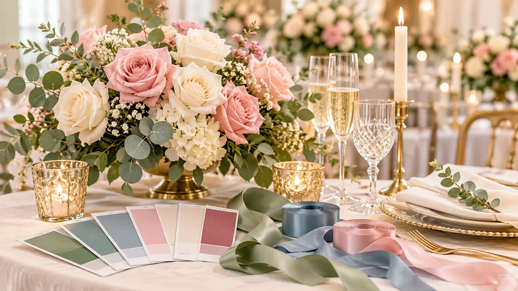
The best wedding colors suit your season, venue, skin tones, and personal style — and work consistently across your attire, flowers, decor, stationery, and cake. Start with one lead color you love, add two supporting colors, and finish with one metallic or neutral accent. That simple 1 + 2 + 1 formula gives you enough variety to style a full celebration without the day feeling mismatched or overwhelming.
Color influences almost every booking that follows. You do not need a design background — you need a small set of colors you can explain clearly to every supplier, and the confidence to stop collecting new options once you have them.
How to Choose Wedding Colors That Actually Work for Your Day
Strong palettes come from four practical checks: season, venue, the people wearing the colors, and how those colors look in photographs. Work through all four before ordering anything.
Start With the Season
Season affects light, flower availability, temperature, and mood. A color that feels fresh in June can feel cold in January, and the reverse is also true.
- Spring: Soft light and returning gardens flatter fresh greens, blush, butter yellow, lilac, and sky blue.
- Summer: Strong sunlight holds up against saturated color, so coral, citrus, bright pink, and vivid green stay visible in photos.
- Autumn: Warm, lower light suits rust, burgundy, mustard, olive, plum, and copper.
- Winter: Short days reward contrast and richness — emerald, navy, burgundy, black, white, gold, and silver create definition after dark.
Season is a guide, not a rule. You can use burgundy in summer or blush in winter — just check flower availability, fabric comfort, and whether the tones hold up in that season’s light.
Let the Venue Narrow Your Choices
Your venue already has a palette, whether you planned it or not. Look at its walls, floors, carpets, curtains, gardens, and fixed lighting before you commit.
A white barn tolerates almost any palette. A ballroom with a burgundy carpet and gold chairs does not. Fighting fixed colors is expensive; working with them makes the room look intentional for far less effort.
Study photos of the venue at the same time of day as your celebration and note:
- The dominant fixed color in the room or outdoor space.
- Any color you must avoid clashing with, such as a bright carpet or painted wall.
- The light quality — warm, cool, bright, or dim.
Then choose a color that bridges your taste and the space. Sage works beautifully with gardens and cream walls; in an industrial loft with black steel and brick, deepen it to forest or olive so it holds its own.
Check Skin Tones, Not Just Swatches
Attire colors sit next to skin all day. A beautiful swatch can still be wrong if it makes your wedding party look tired.
Hold fabric — not a phone screen — up to each person’s face in natural light. Look for colors that even out skin and make eyes look clear.
- Warm skin tones usually suit peach, coral, terracotta, warm red, olive, and gold accents.
- Cool skin tones usually suit dusty blue, lavender, plum, emerald, true red, and silver accents.
- Neutral skin tones handle the widest range, including muted versions of both warm and cool colors.
You do not need every attendant in the identical shade. Mixed tones from the same color family often flatter a diverse group better. Give clear boundaries, such as “any dusty blue, no patterns,” share swatches, and ask for a photo before anyone buys.
Think About Photos From the Start
You will look at your photos far longer than your table linen. Test your palette the way a camera will see it.
Neon colors can reflect onto skin and white dresses. Very pale colors can disappear against a white dress or bright sky. Pure black next to pure white can lose detail. Adjust the shade, proportion, or placement rather than banning a color.
Share your palette with your photographer early. Photograph swatches next to skin and white fabric, indoors and outdoors. If a color looks muddy in those tests, change the shade now rather than hoping editing will fix it.
Wedding Colors by Season: Popular Combinations That Photograph Beautifully
Use these as tested starting points, then adjust one color to make the palette your own.
| Season | Lead Color | Supporting Colors | Accent | Best For |
| Spring | Sage green | Blush pink, ivory | Soft gold | Garden, marquee, and light-filled venues |
| Summer | Coral | Turquoise, white | Bright gold | Outdoor, coastal, and festival-style weddings |
| Autumn | Burgundy | Rust, blush | Copper | Barn, woodland, and historic venues |
| Winter | Emerald | Navy, cream | Silver or gold | Ballroom, evening, and city weddings |
Spring Combinations
- Sage, blush, and ivory: Soft and romantic, with garden roses and greenery-heavy arrangements.
- Lilac, butter yellow, and white: Fresh and cheerful. Keep yellow small — ribbons, napkins, flower centers.
- Sky blue, peach, and cream: Light and calm, excellent for morning ceremonies.
Summer Combinations
- Coral, turquoise, and white: Bold and sunny outdoors. Use white generously so the strong colors do not compete.
- Fuchsia, orange, and green foliage: High energy. Ground it with plain white stationery and tableware.
- Navy, white, and sunflower yellow: Crisp and classic. Navy gives structure; yellow appears in flowers.
Autumn Combinations
- Burgundy, rust, and blush: Layered and warm. Blush stops deeper tones feeling heavy in daylight.
- Olive, mustard, and terracotta: Earthy and relaxed for barns and woodland. Add cream textiles for brightness.
- Plum, fig, and dusty rose: Rich and moody. Gold cutlery adds evening warmth.
Winter Combinations
- Emerald, cream, and gold: Elegant and festive without traditional holiday colors.
- Navy, burgundy, and silver: Deep and formal. Silver reflects candlelight and stops navy reading as black.
- Black, white, and one bold accent: Timeless and graphic. Pick red, emerald, or gold and repeat it with discipline.
Applying Your Palette: Attire, Flowers, Decor, Stationery, and Cake
A palette only works if every supplier uses it the same way. Give each one the same swatches, color names, and a note about which color leads. Verbal descriptions cause most mismatches — “dusty pink” means something different to every business.
Attire
Start with outfits worn all day, because they appear in most photos. Set the lead color for wedding party attire, then use supporting colors for ties, pocket squares, shoes, jewelry, and bouquets.
Mind comfort too: light fabrics show marks, and dark outfits absorb heat outdoors in summer. If partners want different looks, link them with a shared accent — same metal, flower, or pocket square color.
Flowers
Share your palette with your florist as a priority order:
- The one color that must appear.
- Colors welcome if available in season.
- Colors to avoid completely.
Ask which flowers naturally come in your colors on your date. Greenery counts as a color too — bright green, silvery eucalyptus, and deep foliage give very different results, so name the foliage style you want.
Decor and Tables
Use the 60-30-10 balance: roughly 60 percent dominant neutral or lead color, 30 percent supporting color, 10 percent accent — for example cream linen, sage napkins and foliage, and gold candle holders.
Repeat each color at least three times in a room. Used once it looks like an accident; used on napkins, place cards, and candles it looks like a decision.
Stationery
Stationery is often the first place guests see your colors. Use your lead color for borders or headings, and keep body text dark enough to read — pale pink on white can look delicate on screen and unreadable in print.
Order a printed proof. Screen and print colors differ, so check names, dates, and color on the proof before approving the full run.
Cake
Your cake does not need to match exactly — it needs to belong. White or ivory icing is a versatile base for fresh flowers in your colors, a ribbon in your lead shade, colored fruit, or metallic detail.
Share photos of your flowers and tables with your baker. For a strongly colored cake, ask how the icing photographs and whether it can stain lips or a white dress.
Your Step-by-Step Plan for Locking In Wedding Colors
- Collect 10 to 15 inspiration images you genuinely like.
- Circle the colors that repeat. Those repeats reveal your real taste.
- Check them against your season and booked venue.
- Pick one lead color, two supporting colors, and one metallic or neutral accent.
- Test swatches against skin, white fabric, and venue photos, indoors and outdoors.
- Show the shortlist to your photographer and florist; adjust shades for availability and photo tests.
- Create a one-page palette guide with swatches, color names, and usage notes.
- Send that guide to every supplier and anyone buying attire.
- Stop collecting new palettes.
Final Palette Checklist
- Lead, supporting, and accent colors named and swatched
- Palette checked against season, venue, skin tones, and photo light
- Wedding party given written guidance and approved swatches before buying attire
- Florist confirmed which colors are in season on your date
- Stationery printed proof checked in real light
- Baker, venue stylist, and photographer given the same palette guide
- One person holds the final guide, so suppliers get one consistent answer
Budget Guidance: Where Color Choices Affect Cost
Color itself is usually free. How you execute it is where cost changes, depending on flower season, fabric, printing method, and custom items.
Costs vary widely by region, supplier, guest count, and date, so treat any quote as specific to your wedding, not a fixed price for a color. Ask for itemized quotes separating product, labor, delivery, and setup.
Common cost drivers include:
- Flowers out of season: Imported or out-of-season blooms usually cost more and carry more substitution risk than an in-season alternative in a similar shade.
- Custom-dyed items: Matching napkins, ribbons, and fabrics to an exact shade often means custom orders and minimum quantities.
- Printing: Metallic foils, colored card stock, and extra stationery pieces cost more than a simple design on white card.
- Attire variety: Mixed-color outfits vary in price by style and retailer. Agree a spending range before anyone shops.
- Repetition: Linen, signage, favors, lighting, and a colored cake add up item by item. Prioritize surfaces guests see up close and in photos.
To control spending, keep expensive applications small and high-impact: lead color on napkins, ribbons, and candles rather than full tablecloths, rented neutral linen, and foliage plus in-season flowers for large arrangements.
Common Wedding Color Mistakes to Avoid
- Choosing before booking the venue: You end up fighting fixed carpets, walls, or gardens throughout planning.
- Using too many lead colors: Four or five strong colors with no hierarchy compete for attention. Demote most to supporting roles.
- Trusting screens only: Phones shift color and brightness. Judge final choices from physical swatches and printed proofs.
- Naming colors without swatches: Blush, sage, and champagne each cover dozens of shades. Suppliers can match a swatch, not a word.
- Forgetting partners and parents: Everyone in formal photos should sit comfortably inside the palette.
- Matching everything exactly: Identical shades everywhere can look flat. Coordinated tones with texture look richer.
- Ignoring evening lighting: A palette tested only in daylight can turn muddy after dark. Test with candles and uplighting.
Wedding Color Decision Guide: Examples for Real Couples
If you are torn between options, match your situation to the closest example and borrow its logic.
You love bright colors but have a formal ballroom. Keep a formal base — navy, white, and gold — and bring brightness in through flowers only.
You love neutrals but worry the day will look bland. Build depth with texture: cream, taupe, and soft brown across linen, wood, rattan, and matte ceramics. Add one gentle color, such as sage, for attire so portraits have definition.
Your wedding party has very different skin tones. Choose a color family, not a single shade. Dusty blue, slate, and deep teal let each person pick a flattering depth while the group stays coordinated.
Your venue has a strong color you did not choose. Do not duplicate it or clash with it. Pick it up in one small accent, then build the rest from neutrals and a complementary tone.
You and your partner love different colors. Give each color clear territory: one leads in attire, the other in tables and stationery, with a shared metallic or neutral tying them together.
Quick Decision Test
Ask three questions. Do we like it as physical swatches, not a filtered photo? Does it work in our venue without expensive cover-ups? Can we describe it in one sentence? Three yes answers mean you have your palette.
FAQs About Wedding Colors
Q: How many wedding colors should we choose?
Choose three to four: one lead color, two supporting colors, and one metallic or neutral accent. That styles attire, flowers, tables, and stationery with variety, while staying simple for suppliers to follow.
Q: When should we choose our wedding colors?
Choose them after booking your venue and setting your date, and before ordering attire, stationery, or flowers — those purchases lock color in. Decide early, then refuse to revisit the choice.
Q: Can we use more than one color for wedding party outfits?
Yes. Mixed shades within one color family photograph beautifully and let each person wear a flattering depth. Provide approved swatches and a photo check before purchase, so the mix stays coordinated.
Q: What wedding colors work if we have not picked a theme?
Start with flexible classics such as sage with blush and gold, navy with white and silver, or burgundy with blush and copper. These suit many venues, so you can build your theme around them.
Q: How do we tell suppliers exactly which colors we want?
Send every supplier the same one-page guide with swatches, color names, and a note on which color leads. Ask them to confirm the match and flag substitutions before the wedding day.
Conclusion: Pick Your Palette and Build From It
Your wedding colors do not need to be unique or perfect. They need to suit your season and venue, flatter the people wearing them, photograph well, and be simple enough to repeat across the day.
Your next step: gather your favorite inspiration images today, circle the repeating colors, and test those swatches against your venue photos. Then write your one-page palette guide, share it with your photographer and florist, and move on with confidence.

Daniel Morgan is a writer and editor specializing in wedding traditions, cultural celebrations, vows, gifts, food, music, and the stories behind modern wedding customs. At MarryPlane, he explores how couples around the world celebrate marriage while explaining traditions in a respectful, accessible way for modern readers.